MyTravelGov
UX Techniques
Competitive Analysis, Personas, Card Sorting, Information Architecture, Prototyping
Background
MyTravelGov was envisioned to provide customers a one-stop-shop portal for tracking and managing their service requests; securely communicate with staff; and provide timely information for upcoming appointments and travel messages.
Problem
The version of MyTravelGov developed at the time supported only one service, Consular Report of Birth Abroad (CRBA); therefore, the information architecture, navigation, and overall functionality was myopic to that one service. This was a problem because it limited design scalability.
Solution
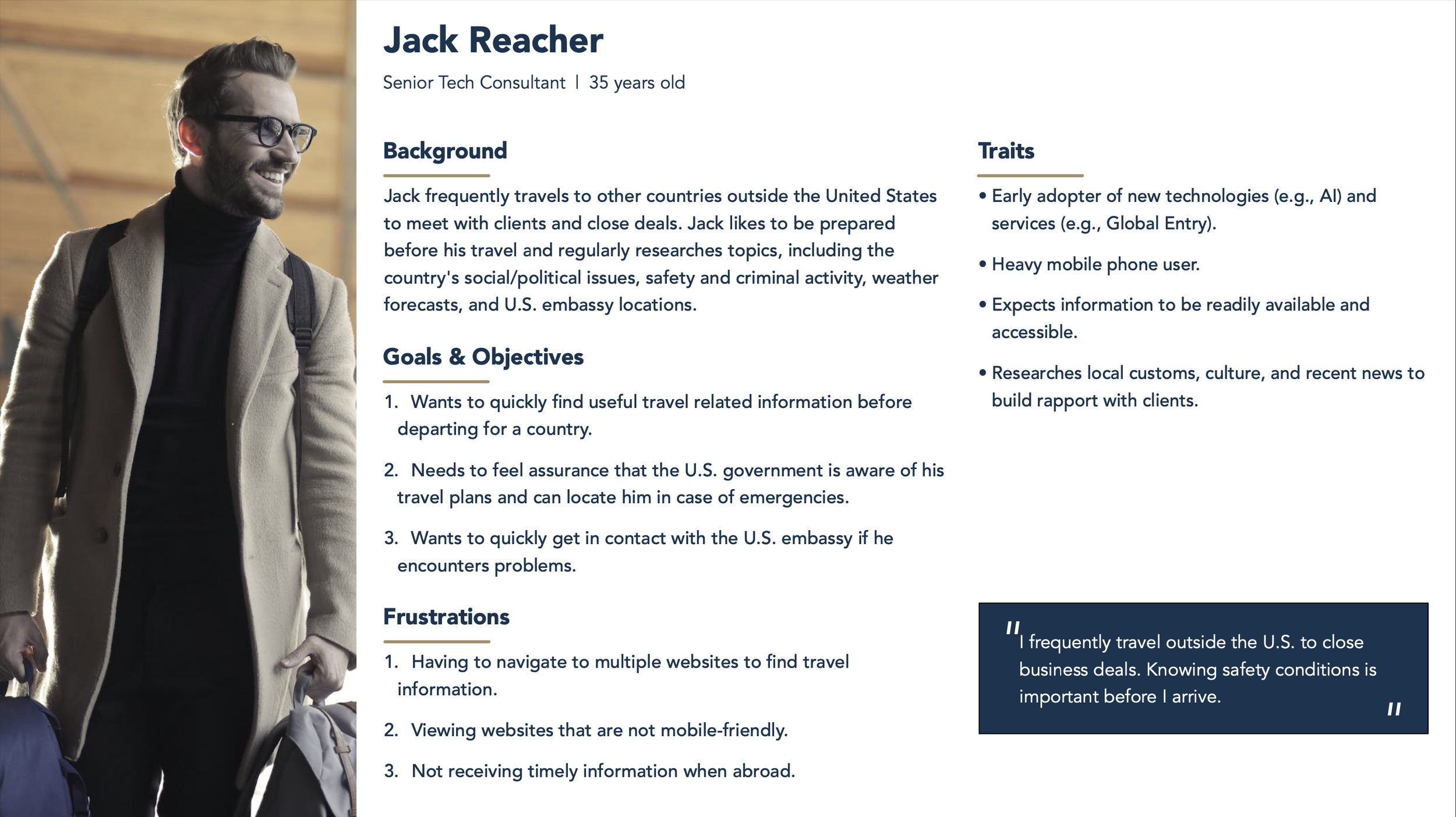
As the lead UX designer, I met with the stakeholders and articulated the problem and performed a card sort research activity so that I could understand what their expectations are for a customer portal. I also presented conceptual designs based on their feedback and provided recommendations on what customer portals typically include. As more users use mobile devices instead of desktop browsers, I designed for mobile-first since the agency’s web analytics showed over 50% of visitors are using smartphones (particularly iOS and Safari). Additionally, I worked with each line-of-business to better understand their users’ goals and pain points so that I could create personas for development teams to keep in mind when building the products.
Outcome
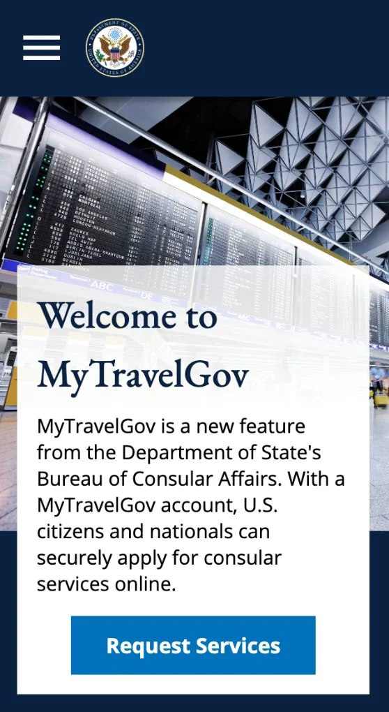
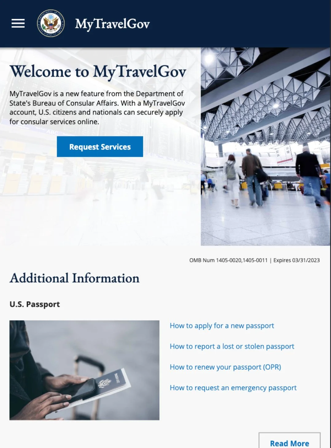
I designed MyTravelGov to look-and-feel like a modern product, but also to behave responsively for mobile devices.
I designed with accessibility in mind and worked with developers to refine keyboard navigation behavior and ARIA attributes for screen readers.
I designed for scalability so that future enhancements could extend upon the foundation; thus, reducing refactoring and potential design limitations.


