Design System and Component Library
UX Techniques
UX Strategy, Team Leader, Design System, Component Library, Accessibility
Problem
The customer had many legacy services and applications, each were developed with varying technology stacks and UI components. Without a cohesive design system and component library, each service / application became standalone silos that looked and behaved differently.
Solution
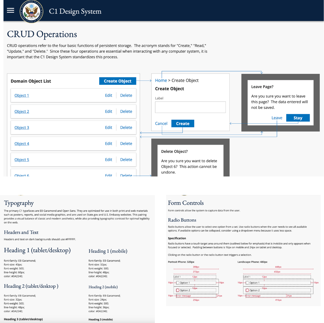
As the lead UX designer, I contributed heavily to the design and development of the ConsularOne Design System and component library. I started with commonly used components (e.g., buttons, input fields, radio buttons) and applied them in various page layouts, use cases, and resolutions. I also examined components from multiple perspectives, including the following:
Scenarios - providing guidance on when one component / pattern is preferred over another;
Target Touch - designing components with at least a 48px touch area;
Micro-Interactions - balancing the need to draw attention without being distracting.
Accessibility - designing how expectations for tab order and keyboard actions, as well as which ARIA attributes to use and when.
Through this exercise, I was able to converge on design patterns and templates, which would become design standards.
Outcome
I was able to build a design system with commonly used components in Axure. These components were created for maximum reusability; therefore, fellow designers did not have to spend time creating one from scratch.
I designed an internal team process for adding / modifying / deprecating components, and the design review criteria for rendering a decision.
I helped standardize design patterns for performing create, read, update, and delete (CRUD) operations, as well as adopted “atomic design” terminology for precise communications.
